5 Super Cool Creative Brand Names For Potato Chips
In this super boring article 😃 I will be brainstorming some really creative
names for chips, these names will tend to be easy, different, brief (I'll explain that in a bit) and along with that I will also be
developing chips packaging mock-ups for those kick-ass brand names.
Designing mock-ups will not only help you in seeing how things on paper convert into a real 3D plus I will also explain each and every mock-up,
like their texture, fonts, colors etc in light of brand building or branding, customer attraction & retention etc and with all of that I will also explain other things like how can colors, logo design, brand name affects, increases your brand mind-share, brand recall, make your brand stand out in the crowd etc.
Before going for the main topic of this article I would like to share one more thing; If you are looking for setting up your own
potato chips factory and wondering about how much it would cost, like the total
investment you will be required to make then checkout this article, Q&A: How Much A Potato Chips Factory Costs ?!
This article will give you all the relevant data for all potato chips business types (small, medium, large), so do read it if you want to launch your
own potato chips brand.
And lastly, if you are totally novice to this whole business thingy then
checkout this Article, it will
definitely brighten-up your brain about how to effectively, efficiently launch, manage, run any
kind of business, yep ANY KIND OF BUSINESS! 😉
Okay now let’s get back to the main topic of this article.
5 Cool Creative Brand Names For Potato Chips!
I can make tons of cool brand names but again, that won’t be
sufficient as there is no accounting for taste, so how about I give you a simple rule to get as many creative names
as possible?!
That rule is actually based on three points, point number one make sure the name you are selecting is
easy, point number two that name should be different/unique and number three it should be brief.
Easy in a sense, that people don’t forget it, can be easily pronounced, for instance
take Apple name, it’s easy, no one would ever forget it.
Apple is also different, unique for its category, you see Apple is a
fruit while the company that has it as its brand name deals in consumer electronics,
so instead of using names like high tech, brain tech, smart tech, futuretech, futech, bigtech etc they went
for something that is totally different, thus making itself stand out in crowd and that makes it more noticeable.
The more different, unique it is, the more it will stand out in the
crowd and consequently far easy for it to get inside your target market head, making a permanent place in there!
Apple is made of five alphabets, that is quite brief, thus making
it more easy to absorb, to be remembered, think about Pepsi, Toyota, Ford, Facebook, Twitter, Tesla, Nestle, Ikea etc.....
So we will be using these three rules to make few names.
Now let’s get to it!
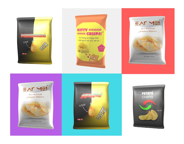
Brand Name: Kitty Crisps!
Brand Slogan: So tasty & crispy that even your cat will
eat it!
Kitty Crisps Packaging Design:
Kitty Crisps Packaging Mock-up:
The name combines two easy words, one is Kitty, second is
Crisps, people love cats, that’s why YouTube is so full of cat videos, while
Crispy is related almost exclusively with snacks especially chips.
Brand slogan not only highlights the above mentioned two
facts but also clarifies to the target market that it’s not a cat food 😉
In the above packaging mock-up I have used orange, yellow as
background colors, orange color is mainly used to signify warmth and happiness while
yellow signifies original thought and inquisitiveness.
The design is pretty simple, less is more in this case plus a picture of kitty signifies the
overall message while the brand phrase “So tasty & crispy that even your
cat will eat it”, will make your consumer curious to read the whole thing and
would make him/her smile (hopefully 😉), that will not only give your consumer a push to buy it (not just for himself but a bag or two for the kitty too! means more sales lol) but will also help in achieving a bit space in his/her mind, thus increasing mind-share for your brand.
Brand Name: SUPER SPICY
Brand Slogan: Potato Meteoroids!
Super Spicy Packaging Design:
Super Spicy Packaging Mock-ups:
The name combines two quite well known, simple, easy words, Super and Spicy,
Super represents chips that are extremely good in taste, crispness, quality and
Spicy represents potatoes chips spiced up with subcontinent spices.
Brand slogan “Potato
Meteoroids!” is quite different, unique, making it stand out in the crowd, plus
represents something out of this world, something from beyond, something
different, the potato in meteoric descend in the middle represent all of this
meaning in form of imagery thus further attaining target consumer attention
which will definitely improve mind-share of the brand in the long run.
While the words “Indian
Masala & Vinegar”, further highlights the special Spicy side of the brand.
Likewise the brand name “Super
Spicy” written in a flame like font and with flamy look, further highlights
the brand claim, its promise.
The background Black color represents sophistication of the brand, makes the packaging more expensive looking, of
higher perceived value while the gold background color represents quality, suggests that this brand is expensive and exclusive, thus making it
more important, worthy of attention in the eyes of its target consumer.
Brand Name: POTATOROIDS
Brand Slogan: Super Spicy
POTATOROIDS Packaging Design:
POTATOROIDS Packaging Mock-up:
I have only changed the name from Super Spicy to Potatoroids,
combining the two words Potato & Meteoroids, thus making a unique, new
brand name, which not only conveys uniqueness to the target consumers which
helps a lot in improving mind-share but also gives marketers some basic idea on how to combine
two ordinary words to make a really cool, simple, easy & unique brand name.
The name Potatoroids is also quite easy and brief (to some extent ;p)
For the rest of details on this brand name, follow the
details given in above Super Spicy
brand name.
Brand Name: EAT ME!
Brand Slogan: n/a
EAT ME! Packaging Design:
EAT ME! Packaging Mock-ups:
The brand name is simple, super brief, super easy; conveys a straight message to its
target audience, that is, to eat it, the brand name is unique (as you won't have heard a chips brand with similar name) which is good for
attaining target consumer attention, focus.
The brand font, represents uniqueness, which again is good
for mind-share, the clutter free design represents clarity, simplicity, focusing
on its core message, which is fire roasted jalapeno pepper being used to spice
up the quality potato chips.
The exclamation mark in the brand name end further suggests a
strong urge from the brand side to its target consumer to eat it, which kind of
makes the whole brand name way more unique than all these other brands out there.
And that uniqueness will definitely convert into more mind-share consequently increase in sales.
And that uniqueness will definitely convert into more mind-share consequently increase in sales.
The brand font with fiery texture on the inside further
highlights the uniqueness of this brand.
The full white bowl, represents quantity along with quality,
the white background color represents the brand cleanliness, a health wise safe product.
Brand Name: POTATO CHIPS
Brand Slogan: n/a
POTATO CHIPS Packaging Design:
POTATO CHIPS Packaging Mock-ups:
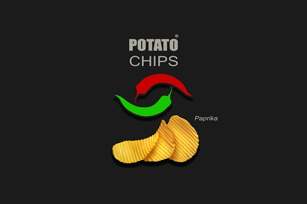
The brand name is simple yet elegantly presented; the whole
focus here is on color combination, overall packaging design, to make it stand
out among the crowd, to make it grab its target consumer attention forever! 😉
The two chilies, in red and green not only represent spice in
the chips but also provide a symmetrical harmony to the packaging.
And the three chips pieces at the bottom further improves the
design symmetry while the background medium black gives its target consumer a
sense of quality, higher perceived value.
In a nutshell, the background color leaves a classy, elegant
impression in its target consumer mind; such a product will be more preferred
by people that are represented by social benchmarks like Elite, Upper Class,
Middle Class in a society.
So that’s it!
If you want me to make 3D mock-ups for your product or to
convert your 2D product pictures into a 3D mock-up then utilize the contact page
on this website.
And yeah don’t forget to subscribe, to receive practical,
helpful tips, suggestions, howto’s on startups, manufacturing, small business,
marketing, branding etc.
In the next article I’ll be discussing and developing
business and marketing plan for potato chips, so again don’t forget to
subscribe! 😉
Don’t forget to share it on with your friends, followers on Facebook, twitter etc.
Over to you guys!
TAGS Business Ideas Business Ideas Pakistan Business Tips Idea Manufacturing Business Small Business start-up Startup Pakistan


No comments:
Post a Comment